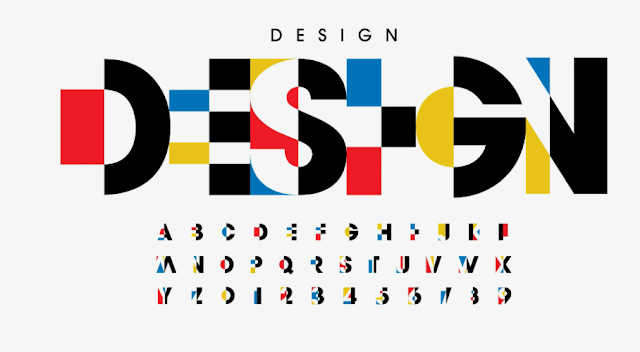
Typography Design
Typography is more than just arranging letters on a page;
it’s a powerful form of visual communication that bridges the gap between text
and art. Rooted in the balance of aesthetics and functionality, typography
design has the unique ability to evoke emotions, convey messages, and guide
readers' attention. This article explores the essence of typography design and
how you can harness its potential to elevate your creative projects.
What is Typography Design?
Typography design is the art and technique of arranging type
to make written language legible, readable, and visually appealing. It involves
selecting typefaces, adjusting sizes, spacing, and ensuring an optimal flow
that aligns with the purpose of the text.
From books and websites to advertisements and packaging,
typography is a cornerstone of design that influences how people perceive and
interact with information.
The Elements of Typography
To create impactful typography, designers consider several
fundamental elements:
Typefaces and Fonts
The choice of a typeface sets the tone for your design.
Serif fonts like Times New Roman convey tradition and formality, while
sans-serif fonts like Helvetica are modern and clean. Script and decorative
fonts, on the other hand, add a personal or playful touch.
Hierarchy
Establishing a visual hierarchy ensures readers focus on the
most important elements first. This can be achieved by varying font sizes,
weights, and styles.
Spacing
Kerning: Adjusting the space between individual characters.
Leading: The vertical space between lines of text.
Tracking: The overall spacing across a group of characters.
Proper spacing enhances readability and creates harmony in
design.
Alignment
Text alignment—left, right, centered, or justified—affects
the overall structure and aesthetics of the content.
Color
The color of the text and its background contributes to mood
and readability. High contrast improves legibility, while complementary colors
create visual appeal.
Typography in Digital vs. Print Design
Typography design differs based on the medium:
Print Design
In print, typography must account for high-resolution
details, ensuring the type remains crisp and clear. Paper texture and ink
absorption also influence font choices.
Digital Design
For screens, designers prioritize scalability and
legibility. Web-safe fonts like Arial and Georgia are commonly used, and
responsive design ensures text adapts seamlessly across devices.
Tips for Effective Typography Design
Understand Your Audience
Tailor your typography to the preferences and expectations
of your target audience. A formal report may require traditional fonts, while a
children’s book can embrace playful and colorful typefaces.
Maintain Consistency
Consistent typography builds a cohesive design. Limit your
project to two or three fonts, and establish a clear style guide.
Experiment Creatively
Typography allows room for innovation. Try overlapping
letters, playing with opacity, or combining contrasting fonts to create unique
visual effects.
Test Readability
Always prioritize readability. Ensure your text is clear,
even at small sizes or from a distance.
Inspiration from the Masters
Famous typographers like Jan Tschichold, Massimo Vignelli,
and Paula Scher have shaped the way we view typography. Their work demonstrates
how thoughtful type design can transform even the simplest message into a
memorable experience.
Conclusion
Typography design is an indispensable part of visual
storytelling. By mastering its principles, you can craft designs that not only
capture attention but also resonate with your audience. Whether you’re creating
a brand logo, designing a website, or publishing a book, let typography guide
your journey toward meaningful and impactful communication.

Comments
Post a Comment